Sunday, February 27, 2011

Crystallographic Balance (27)

Crystallographic Balance
-all over pattern
-special refinement of symmetrical balance


Radial Balance (26)

Radial Balance
-all the elements radiate or circle out from a common central point
-refinement of symmetrical/asymmetrical balance, depending on whether the focus occurs in the middle or off center
-the sun is a basic example


Asymmetrical Balance (25)

Asymmetrical Balance
-balance is achieved with dissimilar objects that have equal visual weight or equal eye attraction

Ways to Achieve Asymmetrical Balance:
-value and color
-shape and texture
-position and eye direction


Symmetrical Balance (24)

Balance
-distribution of visual weight within a composition

Symmetrical Balance
-like shapes are repeated in the same positions on either side of a vertical axis
-one side becomes the mirror image of the other side


-each of these items can be divide down the middle and each side will reflect the other
-each side is even

Wednesday, February 23, 2011

Rhythm and Motion

Staccato
-abrupt changes with a dynamic contrast


The trailers are in a row but in order for the eye to follow it has to lift up. The trailers don't flow together.

Legato
-connecting and slowing


All the lines in this image flow together. The viewer's eye never has to lift off of the piece.

Alternating Rhythm (34)

Alternating Rhythm
-introduce a second motif
-introduce a change in the placement or content of the original motif
-change the spaces between the motifs


The individual roofs create a pattern along with the windows.

Progressive Rhythm (33)

Progressive Rhythm
-shows a sequence of forms through a progression of steps
-repetition of a shape that changes in a regular pattern


Saturday, February 19, 2011

Lost-and-Found Contour

Lost-and-Found Contour
-partial/impartial lines
-our brain as the viewer continues the line even if it doesn't exist or isn't shown as a line
-how we perceive things


Even though parts of the women's bodies are not shown (dark) our brain continues each line as if it were shown.

Line as Value (6)

Line as Value
-creates volume
-created most times by using hatching or cross-hatching


Example of Hatching


Example of Cross-Hatching

Gesture Line (5)

Gesture Line
-approximate
-can evoke a sense of energy, movement, emotion


Just by looking at these images the viewer can sense the movement and emotion in both pieces.

Friday, February 18, 2011

Contour Line (4)

Contour Line
-very specific
-the outer/inner edge
-wants to know where things begin and end

Line Direction (2)

Diagonal Line
-motion


The dancers in this artwork are in a diagonal line. The viewer's eye follows the dancers along the diagonal line creating and seeing motion.

Horizontal Line
-implies quiet and repose
-associate with rest or sleep


Vertical Line
-activity

Line as Shape (1)

Line
-creates shape
-lets us see the object


The placement of the lines depicts the flower (shape).

Wednesday, February 9, 2011

Unity through Continuity (22)

Continuity
-the visual relationship between two or more individual designs


My Art History teacher mentioned that all Egyptian Pharaohs are slightly different yet they all look the same. The majority of the body types are the same and a lot of the face are almost exactly the same. All of the pharaohs were made at separate times but bear the resemblance of each other.

Unity through Continuation (21)

Continuation
-a line or edge that continues from one form to another allowing the eye to move smoothly through a composition


Although there are different colors used in this image the eye flows with pattern throughout the whole image.


I like this photo because it seems as if the staircase is never ending. The viewer's eye will never have to glance over at anything else because it is continuous.

Unity through Repetition (20)

Repetition
-using the same visual element over again within the same composition


The hay rectangles match the cloud rectangles. Instead of having circular clouds the artist chose to use rectangle clouds which causes Unity through Repetition.

Unity through Proximity (19)

Proximity
-the degree of closeness in the placement of elements


I feel like this image shows Unity through Proximity by having enough distance between each object and the viewer's eye is never stuck on one individual object. They are all glass jars. Some alike, some different. Which helps breaks up the piece so that it's not predictable but it is viewed as one image.

Visual Texture (18)

Visual Texture
-a two-dimensional illusion suggestive of a tactile quality


Both of these images look as if you could touch them and feel the texture but actually you wouldn't be able to, that is why it is called Visual Texture. The book gives a few examples of this type of Visual Texture(feathers, rocks, cloth, etc.). A great way to achieve Visual Texture is by a technique called Trompe l'oeil meaning, "to fool the eye." "The objects are in sharp focus and delineated with meticulous care to create an artwork that almost fools the viewer into believing that the images are the actual objects."

Tactile Texture (17)

Tactile Texture
-the use of actual materials to create a surface that can actually be felt or touched


This image looks like it was given tactile texture by using a painting technique called Impasto. Impasto is a "painting technique in which pigments are applied in thick layers or strokes to create a rough three-dimensional paint surface on the two-dimensional surface."

Other examples of Tactile Texture would be certain sculptures and other types of art created by using actual materials (bark, wood, cans, etc.)

Monday, February 7, 2011

Chapter 2: Unity

Unity/Harmony
-the presentation of an integrated image
-means that a congruity or agreement exists among the elements in a design
-they look as though they belong together

Visual Unity
-the whole must be predominant over the parts: you must first see the whole pattern before you notice the individual elements.

Proximity
-an easy way to gain unity
-to make separate elements look as if they belong together
-simply putting the elements close together

Repetition
-something simply repeats in various parts of the design to relate the parts to each other

Continuation
-something "continues" -usually a line, an edge, or a direction from one form to another
-the viewer's eye is carried smoothly from one to the next

Continuity
-visual relationship between two or more individual designs

Grid
-determines page margins and divides the format into areas used on successive layouts

Varied Repetition
-same type of object/scene varied slightly each image

Emphasis on Unity
-examples: Identical Twins, Irises, Company at Table

Emphasis on Variety
-examples: Poster for Art Directors Club of Paris, New Stones Newton's Tones, The Librarian

Chaos and Control
-examples: Signs along Route 66, Bland Unity of a Housing Subdivision, Guggenheim Museum

Wednesday, February 2, 2011

Pattern and Texture

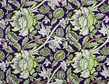
Pattern
-a repetitive design, with the same motif appearing again and again

Texture
-the surface quality of object

Design Project #1 Latent Patterns
-make a visual pattern that is inspired by and references a source found in nature

Nature Picture with Pattern


Nature Picture with Pattern